Monday, October 19, 2009

Eric Carle Collage


This chameleon is inspired by Eric Carle's The Mixed Up Chameleon. Each person in the class created a poster of color. We shared our posters and created collages, similar to Eric Carle's method of creating his artwork. Students could use this to go along with any of his books. The only negative of this project is it is time consuming and messy, although if the teacher is prepared, no student will think this is a bad thing. Teachers could also have the students do an activity like this while learning about animals, space, adjectives, etc. Collages like this are a colorful way to learn about anything!

Safari in the Hallway!


Students in South Dakota live quite a distance from the nearest zoo, let alone safari. However, in this recent project, students can create their own safari in their hallway! Students in this activity use blue lines to draw exotic animals using simple lines. But not all animals are visible to the eye in the jungle. The students take warm colors, such as oranges, reds, and yellows to hid their animal. Only with special glasses they create can they see each other's creations, such as the one I created above. Teachers can use this activity to bring the jungle to the classroom. This provides an excellent chance to teach about different kinds of animals, creativity, colors, and work with both sides of the brain. A must for any level!

Monday, October 5, 2009

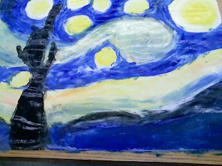
Starry Night


Vincent van Gogh

Starry Night

Our goal was to recreate Van Gogh's famous Starry Night by fingerpainting. We were required to include his infamous texture and bright, bold colors by mixing the primary colors and black and white for shading and tinting. Then we wrote our own stories that went with our personal paintings. Teachers could use a "become the...." in any subject to give the students a new idea in learning!

A boy was in love with a girl and he wanted to give her something special. The girl was special and did not believe in material things. The boy promised her the moon, stars, and the night sky. She said she would marry him if he could deliver this. He wanted to marry her so badly but could not think of a way to give her something so unreachable. He went to his favorite thinking spot on the top of a hill, overlooking the town they lived in. He was about to give up when he looked up and noticed the scenery. He ran home as quickly as he could to get his paint and canvas. He stayed up all night painting all of the beautiful things he saw for her. The next morning when the girl awoke, she found him sitting next to her bed with a painting. She was so happy with his gift to her that she agreed to marry him immediately. They lived happily ever after.

Elements and Principles of Design Composition


Shape and Contrast

For this composition, we were designed one element (shape) and one principle (contrast) of design. I choose stars as a shape. My main star in the center was created using yellow oil pastel with glitter. I surrounded the main star with smaller purple stars to really contrast the two colors. I then surrounded the smaller purple stars with the outline of pink, green, yellow, and turquoise in a way so their counter color would contrast them the best. I used a white and black background to really contrast the colors. The brightness of the colors appears to stick out the best of the black, yet as we can see the colors are brighter on the white side, thus effectively contrasting shape. This is a great art activity to get the students adjusted to the elements and principles as it incorporates group work, individual work, and creativity.

My Footprint


My footprint features my favorite theme: the beach. It represents my many trips to Oceanside, California, to visit my boyfriend while he was stationed at Camp Pendleton in the Marine Corps. I included a palm tree and several hibiscus flowers, my favorite tree and flower, respectively. I added my most recent hobby, a boogie board. The ferris wheel represents my hometown, Huron, South Dakota, home of the South Dakota State Fair. Finally, Semper Fi means "Always Faithful" in Latin; it is the Marine motto and my wink and nod to my boyfriend, Adam. I created this using oil pastel, glitter, colored pencil, and markers. This would be a wonderful activity to use as an ice breaker on the first day of school, as well as to gain ideas on what your students will enjoy as activities and to get to know them a little better.


Frida Kahlo

Self-Portrait with Loose Hair

Description: The Facts:

  • Lines: Hair, script, vines
  • Objects: Script, leaves, face, hair
  • Shape: Circles, formless blobs, triangles, squares
  • Textures: Leaves, hair, skin
  • Values: Warm colors (red and yellow), green, white, brown, black, bronze

Analysis: The Design

  • This is a self-portrait. She uses contrast with the bold red and yellow against an abstract black and white background. The contrast in shape is stricking as well. Frida is the focus of this painting.

Interpretation: The Meaning

  • She is documenting herself at a happy time in her life. She is 37 years old and in Mexico. She has bright eyes with a silent expression. In her other portraits, her hair is up in a tight bun, and by letting her hair down she must have been feeling relaxed at the time.

Judgement:

  • She uses great color in her dress. The red and yellow clothing against the tone of her skin is amazing. She let her hair down which causes the viewer to think she was happy and wanted to record her feelings. I enjoy her description of her portrait at the bottom as it adds a Spanish theme and beauty to the painting.